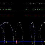
Chromosomes are large DNA-molecules containing the information for huge numbers of genes. Although we are dealing with a completely different scale, when compared to the visualization of genes, we are having exactly the same problem: A linear sequence of huge amounts of data.
The data visualized here as an example have been taken from chromosome 1 of the model plant Arabidopsis thaliana. This chromosome has a size of about 30.000.000 base pairs (coding elements) and contains about 8.000 genes.
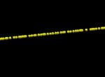
The main feature we will use for visualization is the position of a gene on the chromosome. Doing this we can line up the genes (yellow spheres) like pearls on a string.
- Sequence of genes
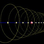
Unfortunately the string is very long and there are lots of pearls… In the following image the chromosome has been arranged in the form of a spiral and is only visible due to the various genes located along its sequence. The axis in the center of the spiral is labelled every 3.000.000 base pairs. The position of the telomers (chromosomal ends) and the centromer (attachment site for moving the chromosome) are marked by red labels.
- Arabidopsis, chromosome I
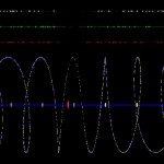
Here comes the same structure from a different perspective.
- Arabidopsis, chromosome I
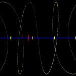
It looks a bit boring, doesn’t it? The only feature one can recognize is a relatively low density of genes close to the centromer, and even this is difficult in the global view. It becomes clearer when zooming in like in the following image.
- Arabidopsis, chromosome I
Well, so far not very interesting, but we can integrate other data into the picture and then it becomes somewhat more interesting. Below I have integrated microarray data highlighting genes predominantly expressed in flowers (white colour), leaves (green colour) and roots (red colour). In addition, transcription factors are labelled by larger spheres and in blue colour in the chromosomal spiral.
This is still a very abstract presentation of a chromosome. In the next post I will finally try to present something more visual…
Further reading:

